Explore
General Exploration
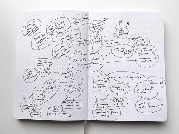
In this section I talk about the brainstorming process for the overall project. Further below, you can see the rest of the exploration stage broken up by Branding and UI/UX sections.
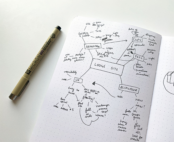
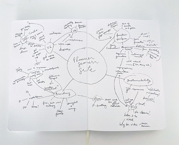
Mind Maps + Brainstorming
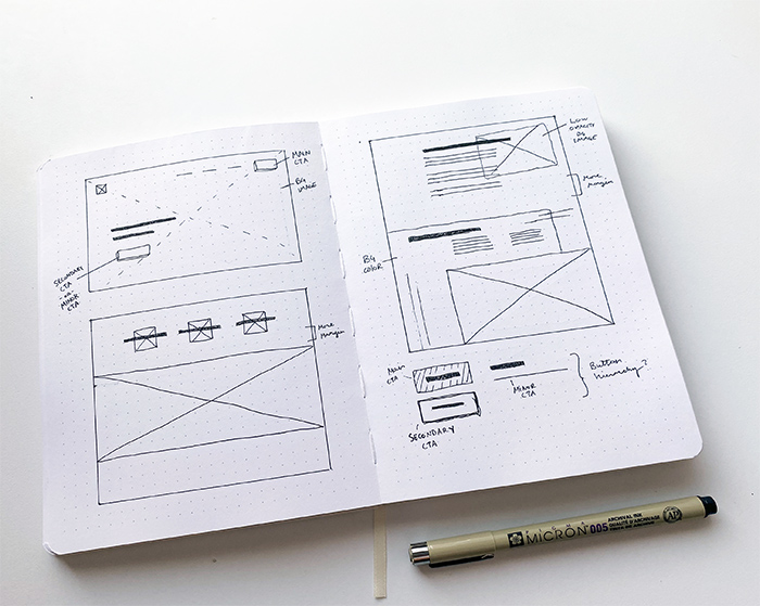
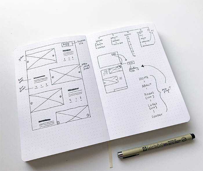
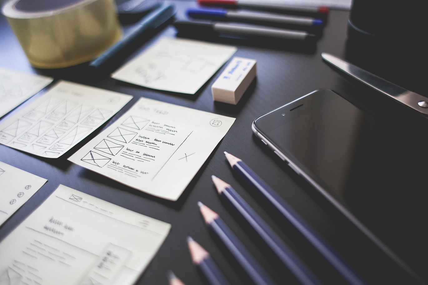
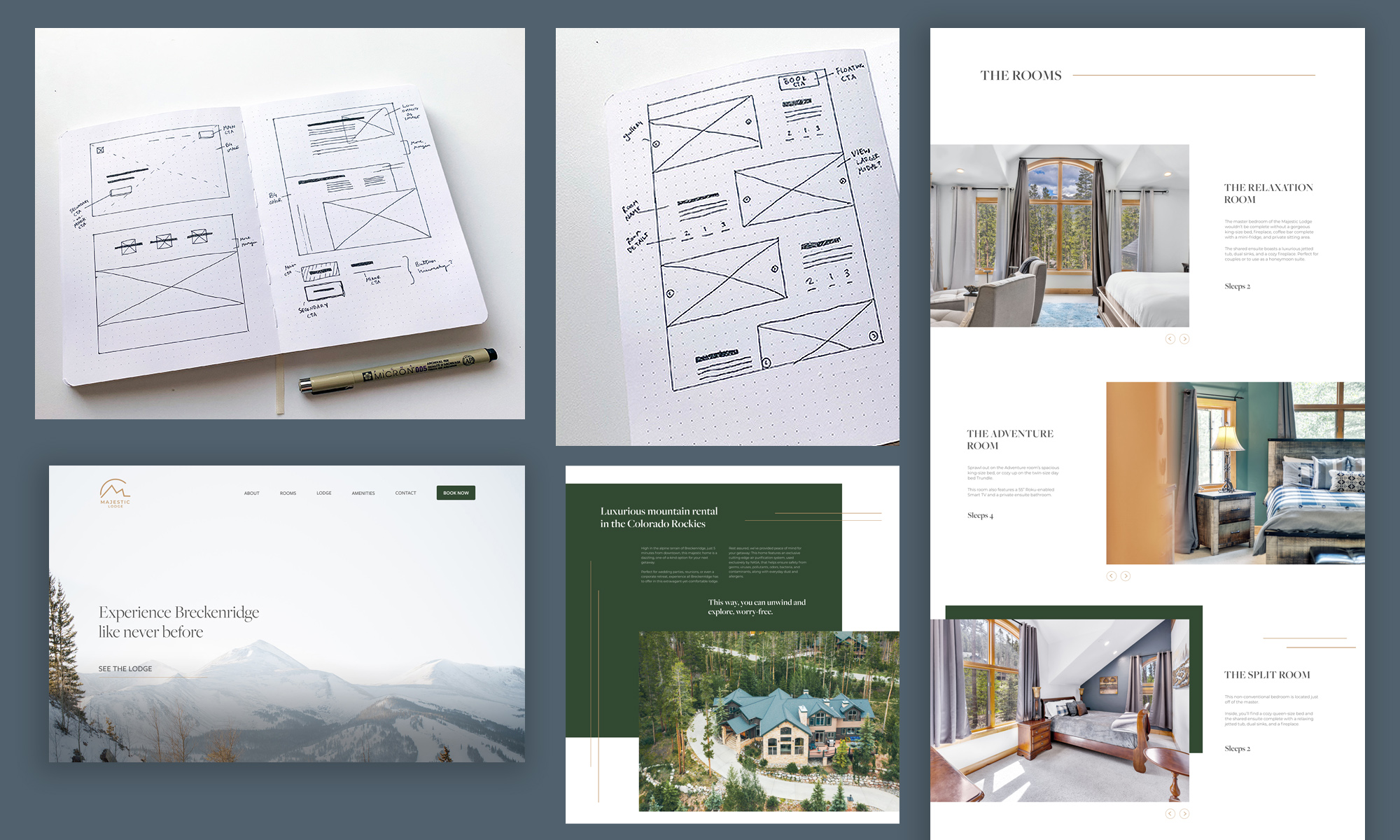
I started off with pen and paper to jot down general ideas for the user experience and branding in one step.

Branding
Color Scheme
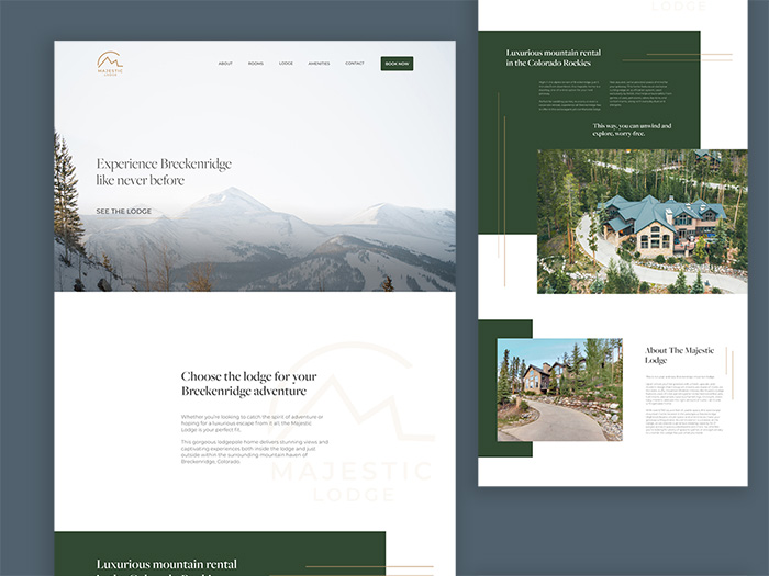
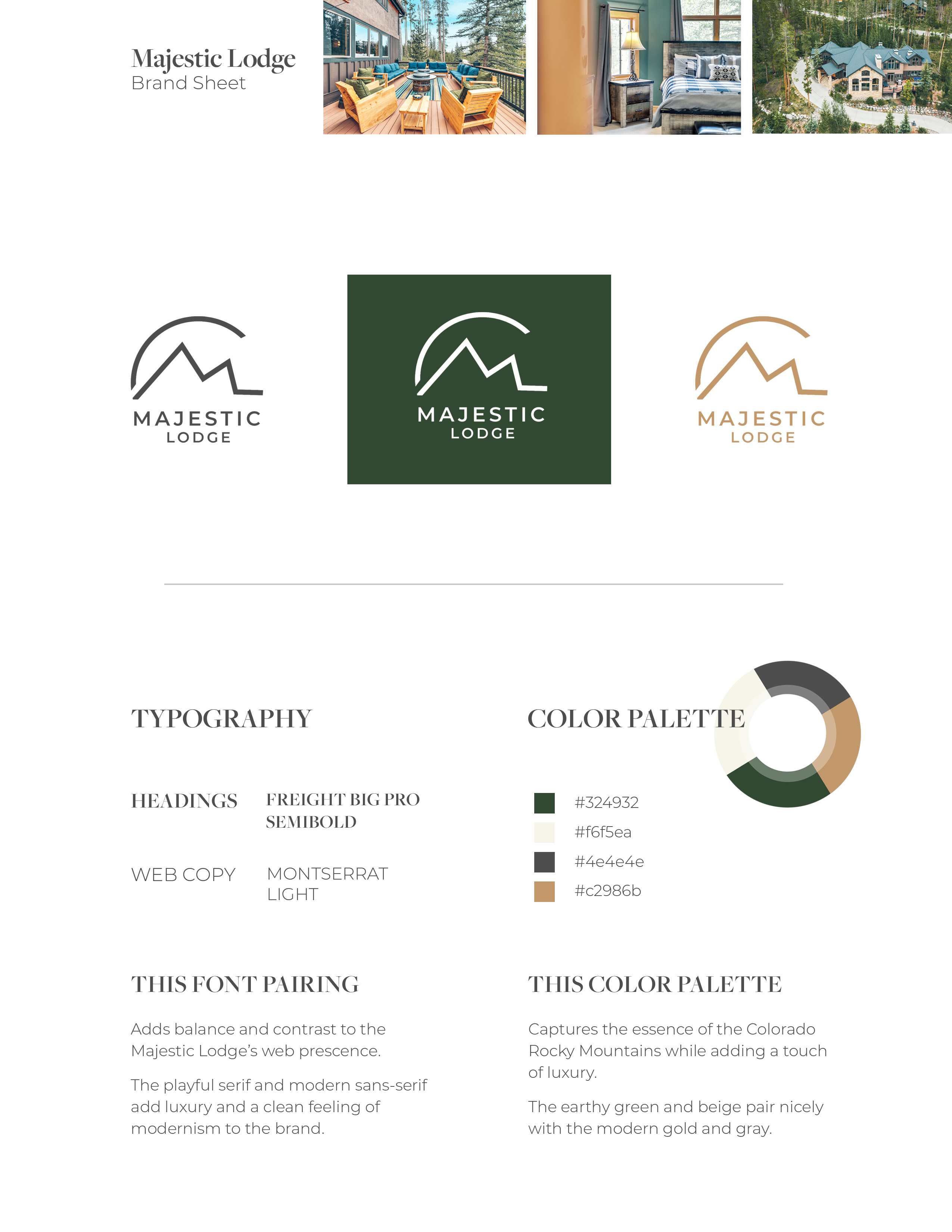
Next, I dove into creating the color scheme. I kept two of the colors, the dark green and the cream color. To add an upscale feel, I replaced the warm brown color with a sleek gold and added pure white and deep gray for text.
Thinking ahead, I noted that instead of relying on the dark green color for text, I’d opt for pure white and a deep gray to lighten the feel of the site, as well as adding plenty of whitespace for the pure white to shine.
Logo
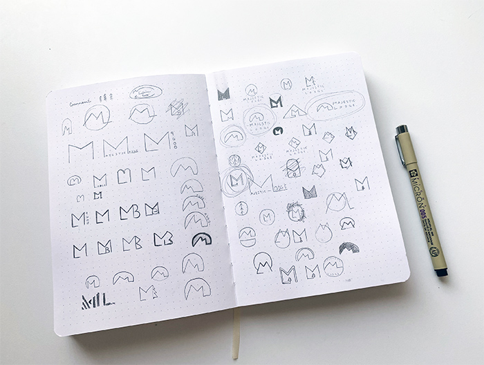
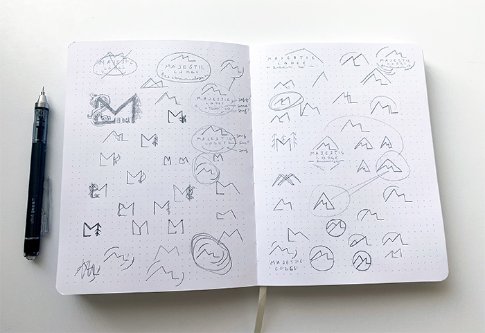
For the logo, I filled four dot-grid notebook pages with sketches of potential options and ideas. I first started with sleek and sharp letterforms using the initials M and L to explore the high-end feel. Then, I sketched more earthy and woodsy options, like mountains with a sun behind it or branches, plants, and tree motifs.
Next, I created several options combining the two. Some really worked, and some were less than on-target. All of them were a blast.
When deciding which logo sketch to develop further, I opted for one with a good balance of contrast in shape, as well as one that would make sense for the brand. Since we needed to keep some of the mountain aspects of the brand, I created a mountain range outline using the M and L initials. Adding sharper lines in the mountain range helped make the mountain aspect feel less rugged and more modern, while adding the outline of the sun softened the overall look.
I also leaned toward two typefaces that had a unique balance of contrast throughout: Montserrat and Candara. They make the logo clean while still showing personality through uniquely playful head serifs (Montserrat) or letterforms (Candara).
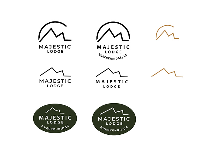
Below you can see three primary logos with variations in typeface or shape, and two sub-mark icon logos. I also started playing with color here by revisiting the brand’s green color and added a new gold color.

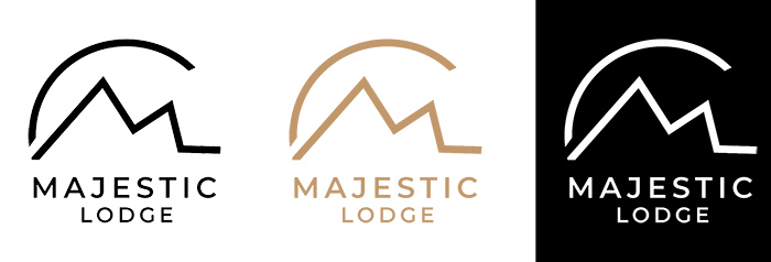
After speaking to the client, we decided on the first image with the Montserrat typeface for a simple and clean look. I quickly mocked up final variations of the logo in black, white, and the new gold color.

UI Design
User Flow
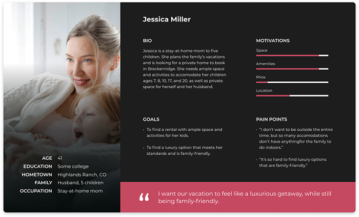
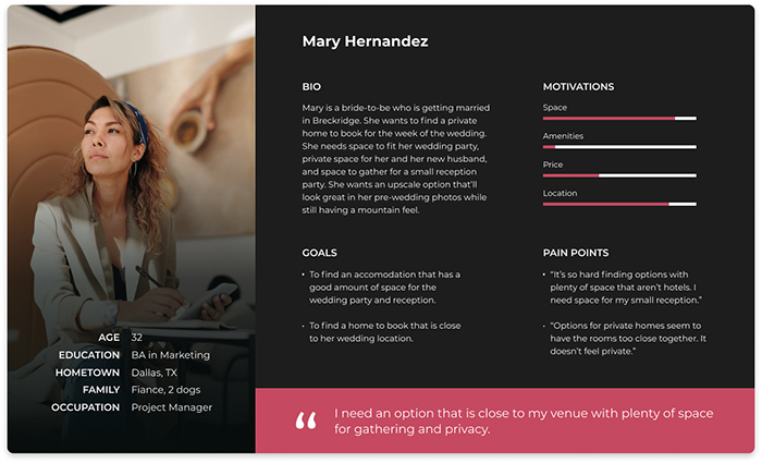
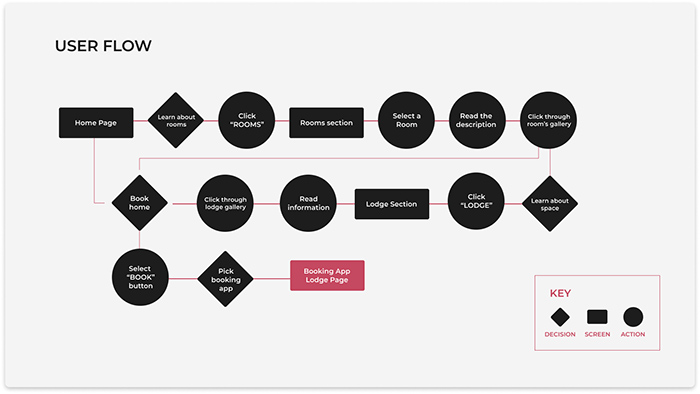
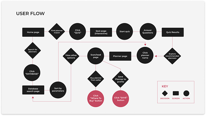
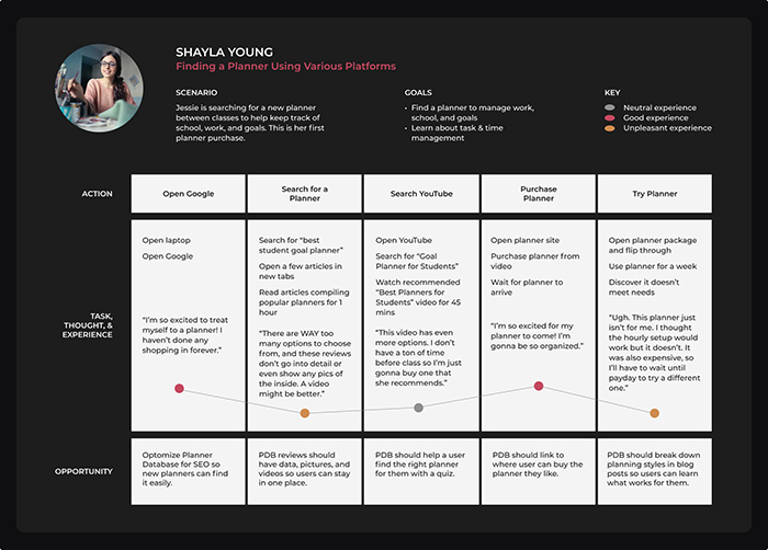
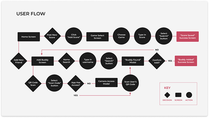
During the earlier research, it became quickly apparent that there are many approaches users take when deciding to book accommodations. Most may hone-in on the areas that matter most to them, like rooms or amenities, while some like to stay on the site a while and learn a ton about the property.
The user flow below shows a few of the different routes a potential renter can take, and demonstrates that it needs to be easy to book from anywhere in the flow.

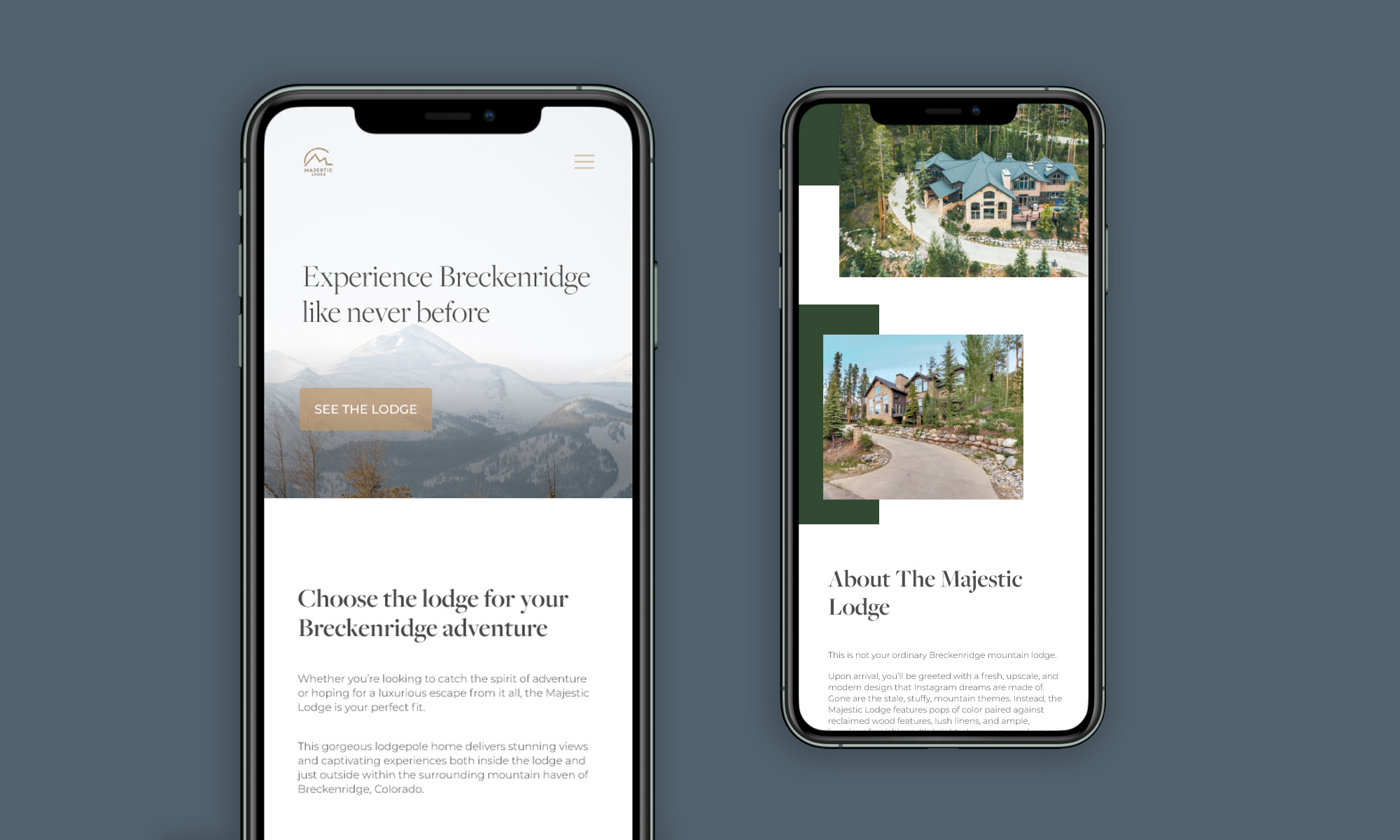
Since the client’s main goal is to make it easier for their preferred clientele to book, I opted for a floating “book” button that stays with the user along the page, as well as the main navigation links. This way, no matter where the user is on the page or site, they can easily book from anywhere in their journey.
Sitemap
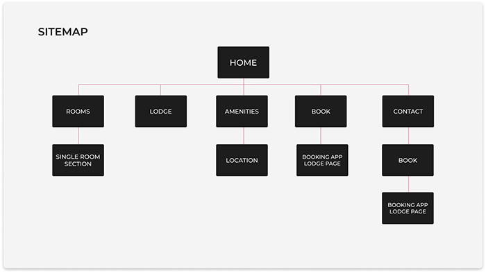
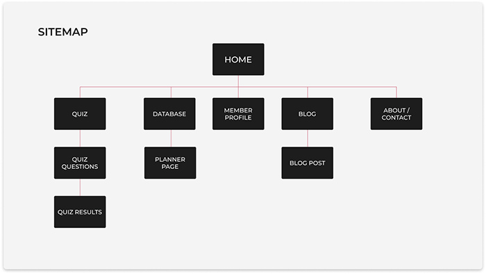
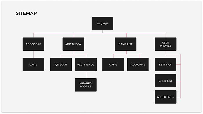
Though the site is a single-page design, I laid out the different sections as ‘pages’ in the sitemap, to help keep everything organized before starting the overall design.

Wireframes
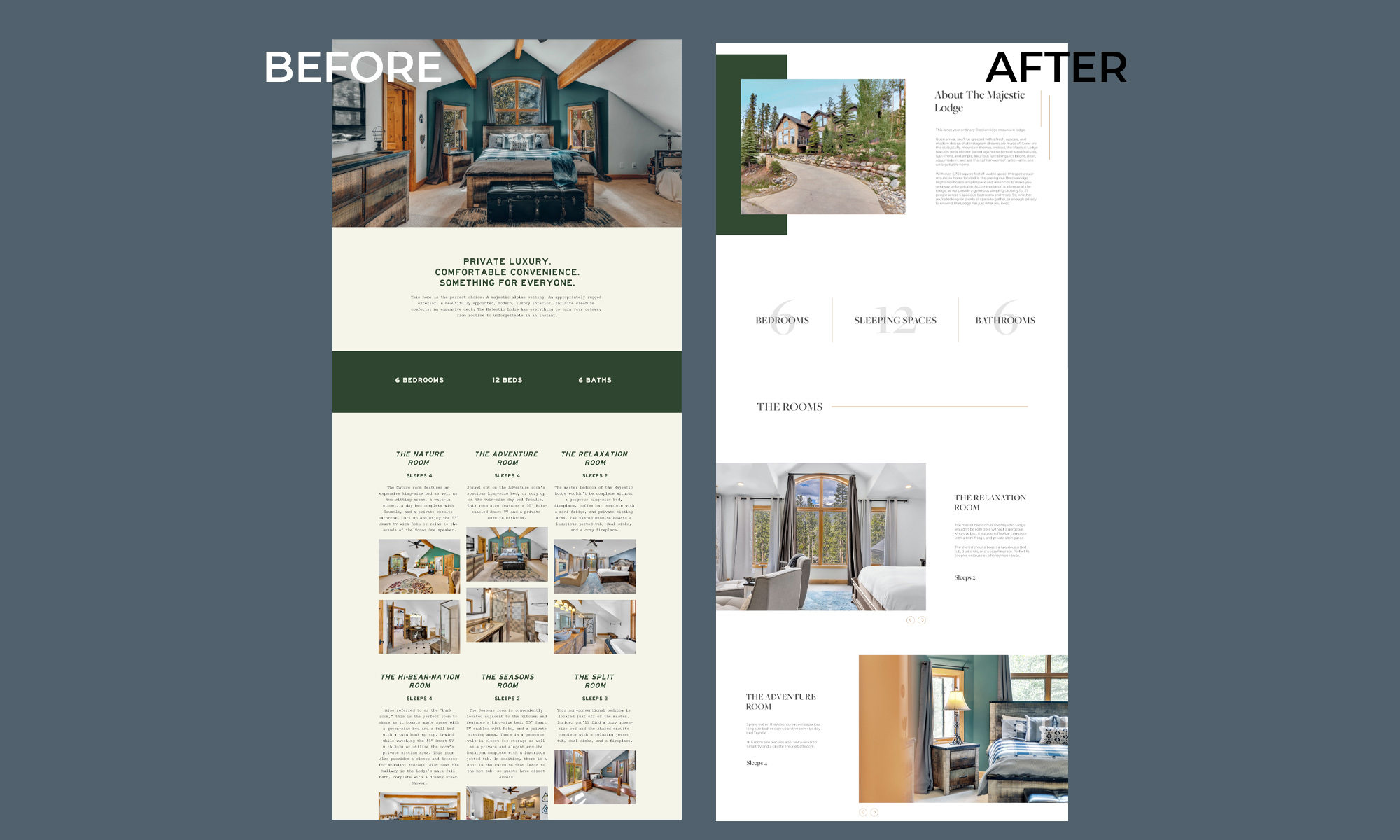
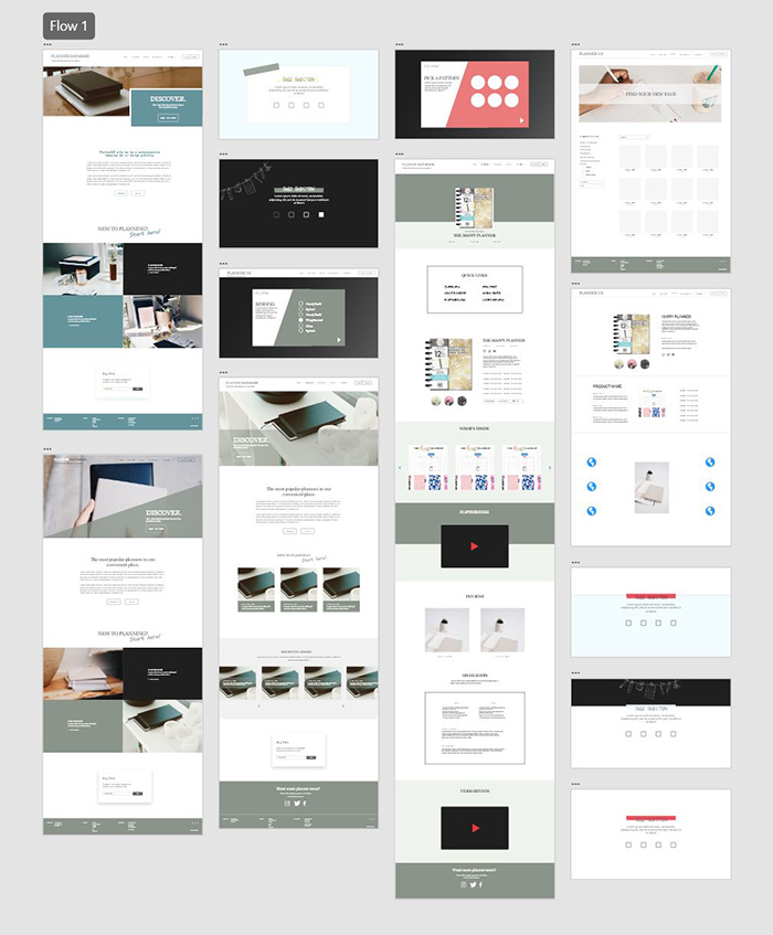
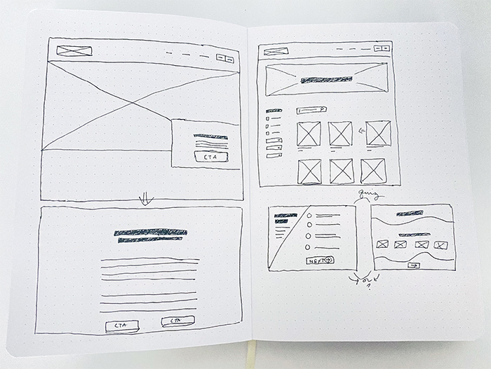
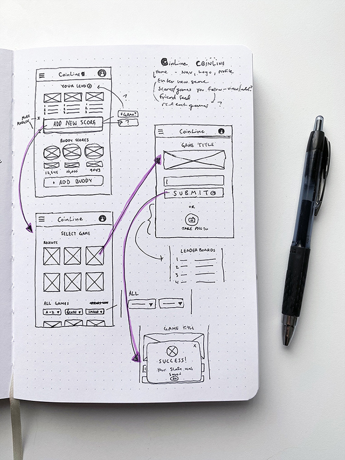
Knowing the site would be a single-page design, I started wireframing with section design in mind. I typically focus purely on function only when diving into the wireframing, but because the aesthetic factor was such a huge part of this process, I also approached this stage with that in mind.
My goal here was to set up a functional way to display information, but to also see how little design elements and aesthetically-structured content would look in the most lo-if stage. If it looked good at this point, I knew it would translate well in the final design.
